Soliloquy Documentation

Documentation, Reference Materials, and Tutorials for Soliloquy

How to Customize the Play/Pause Buttons

Would you like to customize the play/pause buttons on your slider? This is easily done with a little help of CSS. We’ll show you how to customize the play/pause buttons on the Soliloquy slider.

This tutorial is a little more technical as it requires basic knowledge of HTML and CSS.

Setup

Step 1 – Install and activate the CSS Addon

Your first step will be to install and activate the Soliloquy CSS Addon.

If you need any assistance in installing addons, please take a look at this article.

For this instance, we’ll be installing the CSS Addon.
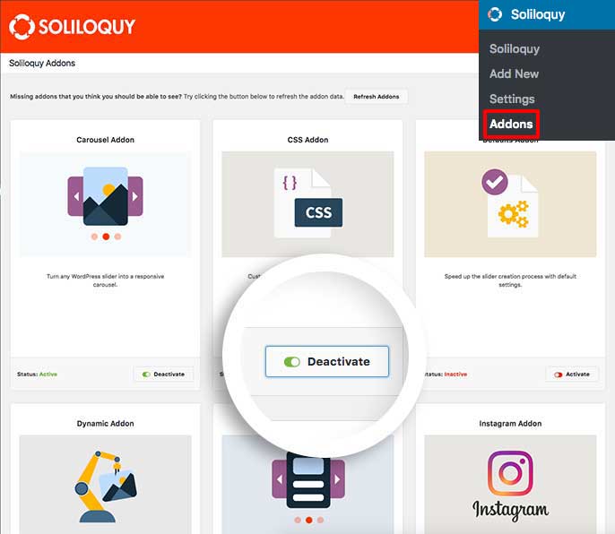
Activate the CSS addon

Step 2 – Create or edit your slider

Next, create a new slider or edit an existing one. You can follow along with our documentation for creating your first slider.

For this tutorial, we’ve used the Base Slider Theme.
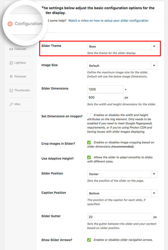
The tutorial is based on the slider theme Base selected from the Configuration tab

Step 3 – The CSS

The CSS we’ve used in our demo is shown below.
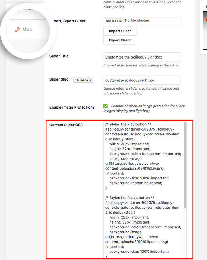
To customize the play/pause buttons add your CSS to the Misc tab

You’ll need to change this ID number to match your slider ID number. You can find this by looking in the sidebar of your slider edit screen.

For more information on how to find your slider ID number you can read this article.

[css]/* Styles the Play button */
#soliloquy-container-509075 .soliloquy-controls-auto .soliloquy-controls-auto-item a.soliloquy-start {
width: 32px !important;
height: 32px !important;
background-color: transparent !important;
background-image: url("your URL goes here") !important;
background-size: 100% !important;
background-repeat: no-repeat;
}
/* Styles the Pause button */
#soliloquy-container-509075 .soliloquy-controls-auto .soliloquy-controls-auto-item a.soliloquy-stop {
width: 32px !important;
height: 32px !important;
background-color: transparent !important;
background-image: url("your URL goes here") !important;
background-size: 100% !important;
}
/* Positions the play/pause button within the slider */
#soliloquy-container-509075 .soliloquy-controls-auto-item {
width: 32px !important;
height: 32px !important;
position: absolute !important;
bottom: 10px !important;
right: 10px !important;
}
[/css]
Be sure to update the -509075 with your own slider ID number

If you’d like to change this for all sliders, just add the CSS to the WordPress customizer.

Check out our demo of this in action!

Also included above is the CSS needed to have the navigation arrows match your new play and pause buttons for the slider.

Finally, click Publish or Update on your slider, you’re all set!

Would you like to customize the video play icon? Take a look at our article on How to Customize Video Slide Play Icon.


FAQs

Q: Can I customize the navigation arrows as well?

A: Absolutely, below is the CSS we used to target those arrows

[css]/* Styles the matching right arrow */
#soliloquy-container-509075 a.soliloquy-next {
background: none !important;
background-image: url("your URL goes here") !important;
background-size: 100% !important;
background-repeat: no-repeat;
}
/* Styles the matching left arrow */
#soliloquy-container-509075 a.soliloquy-prev {
background: none !important;
background-image: url("your URL goes here") !important;
background-size: 100% !important;
}[/css]
Q: Why do my images look stretched?

A: You may have to tweak the background-size until your images appear as expected. The image sizes used for this demo are 128px x 128px.