How to Display Different Sliders on Desktop and Mobile in WordPress
Are you thinking to show unique WordPress sliders on mobile and computer screens? Sometimes you may need that when your website is browsed from desktop and mobile, it shows different image sliders on both devices. In this tutorial, we will share how to display different sliders on desktop and mobile in WordPress.
By default, you can’t create the image sliders on your WordPress website. It is recommended to use a plugin like Soliloquy that has amazing features to give you the full control over your sliders.
To display different sliders on desktop and mobile in WordPress, you’ll need to follow these 4 steps:
- Step 1. Install and activate Soliloquy slider plugin
- Step 2. Create two image sliders on your website
- Step 3. Display different sliders on desktop and mobile
- Step 4. Add the additional CSS to hide the sliders
Ready to get started? Let’s go!
Step 1: Install and Activate Soliloquy Slider Plugin
The first thing you need to do is to install and activate the Soliloquy slider plugin on your WordPress website.
Wondering how to do it? Check out this complete installation guide of Soliloquy to easily install the plugin in WordPress.
Step 2: Create two image sliders on your website
Upon activating the plugin, you need to go to Soliloquy » Add New from your WordPress admin to create the first slider for desktop.
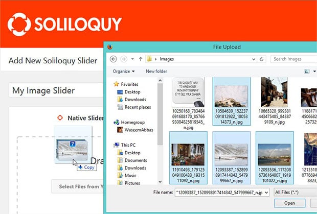
Let’s start by adding a title and drop the photos in the Native Slider section.
After adding the photos, hit the Publish button. Simply repeat the process to create another slider for mobile devices.
For basic settings, you should check out this complete guide on how to create an image slider in WordPress.
Step 3: Display Different Sliders on Desktop and Mobile
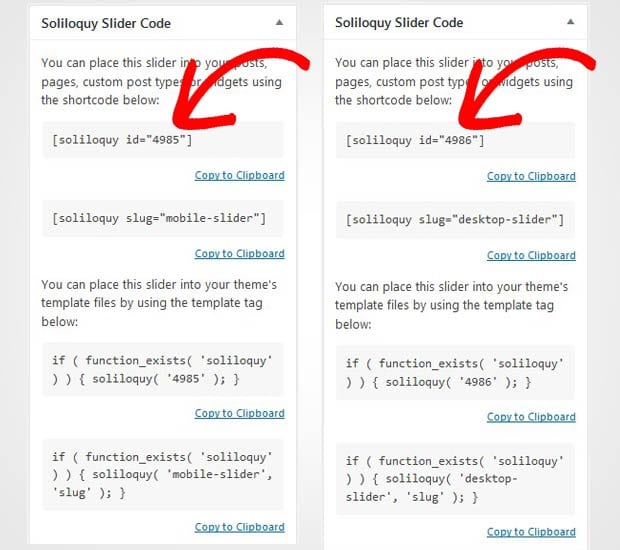
Go ahead and edit the two image sliders one by one. You need to copy the shortcodes from Soliloquy Slider Code widget of both the sliders.
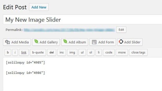
Next you need to go to Posts » Add New or edit an existing post. Paste the shortcode of both the sliders in the visual editor.
Make sure to click on the Publish/Update button. Simply visit your website from desktop and mobile devices to see the two different image sliders on one page that will look like as shown in this image below:
Step 4: Add the Additional CSS to Hide the Sliders
Now you have the two image sliders in one WordPress post. It’s the time to add CSS to display different sliders on desktop and mobile screens.
Simply go to Appearance » Customize from your WordPress admin. In the Additional CSS section, paste this code:
[php]/*This is the mobile slider */
#soliloquy-container-4985 {
display: none !important;
}
@media only screen and (max-width: 600px) {
/*This is the desktop slider */
#soliloquy-container-4986 {
display: none !important;
}
/*This is the mobile slider */
#soliloquy-container-4985 {
display: block !important;
}
}
[/php]This CSS snippet will hide the desktop slider on mobile devices and mobile slider on desktop screens. You need to replace 4985 and 4986 with your respective Soliloquy slider codes (edit the image sliders to find the code in the Soliloquy Slider Code widget).
It will now display unique sliders on desktop and mobile devices.
That’s all! We hope this tutorial has helped you to learn how to display different sliders on desktop and mobile in WordPress. You may also want to check out our guide on how to create a responsive slider for Envira Gallery. In case, your slider images are loading slow, check out this ultimate guide to boost speed and performance.
If you like this tutorial, then please follow us on Facebook and Twitter for more free WordPress guides and resources.


Frank
Soliloquy is sold as a responsive slider. This method is not responsive. No way to change the amount of slides (columns) on a carousel slider on mobile? Very basic responsive feature. Any tips how to do this please?
Barbi Atkinson
Hi Frank and thanks for your feedback! We do give the ability to turn the Carousel off for mobile with a checkbox but not an option to change the amount of slides. However, I’ve requested this for you as a possible future feature request. There’s no guarantees that it will be implemented but it will be reviewed and discussed. If we can help with anything else, please feel free to reach out to our support! https://soliloquywp.com/contact/
Ready to start creating slides the easy way?
Get Soliloquy NowWe use cookies to improve your experience on our site. By using our site, you consent to cookies.